

Human Resource Analytics
This interactive visualization leverages data to highlight key metrics such as employee demographics, performance, and turnover rates. By presenting this information in a clear and visually appealing manner, the dashboard enables HR professionals to make data-driven decisions that can enhance workforce planning and management.
The project was created following a tutorial from Data Tutorials. The human resources data was provided in an Excel sheet that was well prepared for this data visualization.
One of the standout features of this dashboard is its ability to break down employee demographics by various categories, including age, gender, and department. This granular view helps organizations understand the composition of their workforce and identify any potential diversity issues. Additionally, the performance metrics section allows managers to track employee performance over time, identifying top performers and those who may need additional support or training. This targeted approach ensures that resources are allocated effectively to maximize employee productivity and satisfaction.
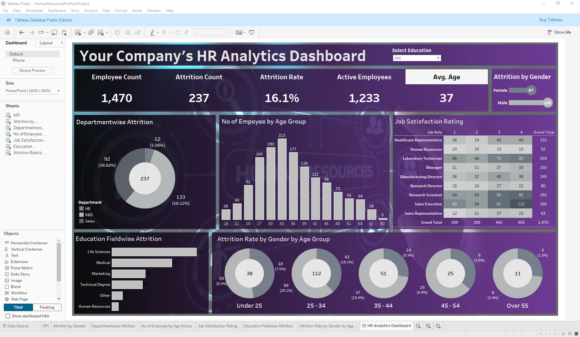
The dashboard’s interactive elements, such as filters and drill-down capabilities, make it easy to explore the data from different angles and uncover actionable insights. This HR Analytics Dashboard is an essential tool for any organization looking to optimize its human resources strategy through data visualization.
View the final project on Tableau Public