

Tableau Dashboard: Customer Analysis
A quick Tableau dashboard was created to learn more about calculated fields, filters, and created custom graphs. This Customer Analysis dashboard contains Revenue by State featured on a repsonsive map as well as a custom donut chart for the Percentage of Revenue per Region graph.
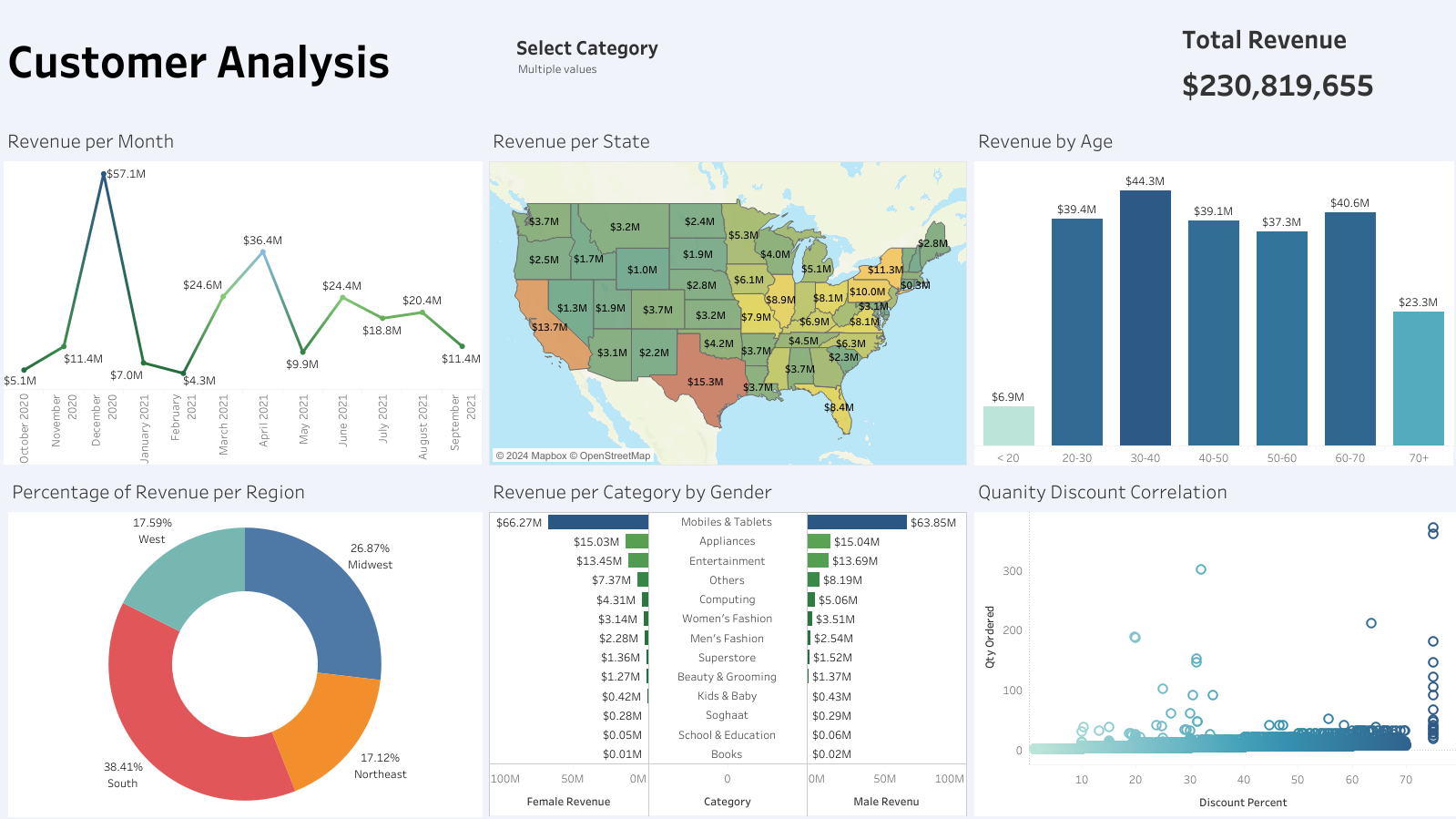
One of the key takeaways is the identification of the most profitable customer segments. By analyzing metrics such as total revenue, average order value, and purchase frequency, the dashboard highlights which customer groups contribute the most to the business’s bottom line. This information is crucial for targeted marketing efforts and resource allocation, ensuring that high-value customers receive the attention and incentives needed to maintain their loyalty.
Another significant insight from the visualization is the breakdown of sales by region, product category, and time period. This granular view allows businesses to pinpoint trends and seasonal variations in customer purchases. For instance, certain regions may show higher demand for specific products during particular months, enabling more effective inventory management and promotional strategies. Additionally, the ability to drill down into individual customer profiles and transaction histories provides a deeper understanding of customer preferences and behaviors, facilitating personalized marketing and improved customer satisfaction.